Effective Planning
When considering a plan, effective planning is the key to success. Without the following skills you will be unable to progress to the next stage, production, as you’ll always be stuck in pre-production because your planning wasn’t effective.
When we started planning a design for an app within five minutes it was clear that this is not standard practice. We had nothing to go off of, and this was our first mistake, we had only ideas on the spot. You might be able to get one or two good ideas out but none of them were effective or thought-out.
After the use of verbal communication and debates using the ideas on paper and combining them using a mind-map everything became clearer. The importance of verbal, visual and written communication is vital to getting a key idea across, the following skills help develop ideas and help isolate ideas that would end in disaster early using debates and discussions.
Discussions & Debates
Discussions and debates are important to getting an idea across or developing one. The use of a discussion could bring up new ideas or subtract from a design that is over-flowing into an unprecedented mess. Discussions are seen as the use of verbal communication, verbal communication is key to other members of a group when pitching an idea.
Verbal Communication: Communication method, discussions, debates, interviews, meetings.
Visual: Sketches, Mind map, presentation, storyboard, & layout designs.
Written: Timeline, shot list, annotations, the script (plot outlines)
Layout Design


The importance of layout design, layout design is an indication of or rough sketch of how a page will look like for example, I know that TH means header and I know what size font to put inside that box. the cross across the b, s an indication of an image, and squiggly lines indicate paragraphs of text.
Layout designs are a quick and easy way to understand where your design is going without taking up much of your time. It allows you to visualise how your design is going to look before needing to finalise your project.
Layout designs are everywhere, predominantly in Office products, Word and PowerPoint presentation, these are digital examples of how you can visualise your power point presentation before typing anything up into the textual area. Below is a digital example of layout design found on Google Images.
Illustrator
Pixels vs Vector, what is the difference?

On the right is Photoshop which edits image in a pixel based format, any images that you edit in photoshop will loose detail the more you edit. Photoshop is an image manipulation program, it’s mainly used to crop out images and manipulate them to be something, for graphic design you should use Adobe Illustrator.
Adobe Illustrator (on the right) is a similar program to photoshop and a majority of the tools carry over from photoshop. Adobe Illustrator edits in a vector format, no matter what you create within the program it will always retain detail as it is editing in a vector format. A vector image is an image that won’t loose detail the more you enlarge or decrease in size, a vector image is created using mathematics rather than a pixel based format.
A handy command to remember is CMD + 0 it will reset the entirety of your zoom to fit the page.
Shape builder tool


In the shape builder tool you can create shapes to your needs, any images that are overlapping can be drawn through to create your own “original shape”. A handy shortcut to remember is ( Shift + M )
Live Paint Tool


Before you can use this tool you must make sure to highlight all the shapes that you want to fill. Above is an example of the live paint tool in action, any images that are now highlighted can be filled to create new custom shapes will the fill tool.
Layer Trace


Layer trace is a tool that takes an image and turns them into shapes and outlines, the tool is design to find and trace lines in imagery.
Pen Tool
Creating Outlines


When creating outlines first you must type in a selected word or sentence using the text tool. Once you have completed this step you can then right click on on the text and select create outlines. Once you have created outlines for you text you can then manipulate the shaping of the text or move it to wherever you want by using the Direct Selection Tool.
Pen Tool


The pen tool is both a blessing and a curse, The Pen tool can create custom shapes with a simple click of a button. There are three rules to the pen tool. Firstly you must click to start the line and click a second time once you have moved your mouse to create the first line, to create a circular line you simple hold option and move the anchor in the direction that you so desire. If you want to complete the image without making the shape entirely, hold cmd and click anywhere on the page to complete the image.
Depending on where you look and what you research you’ll come across numerous different forms of the 3-7 process regarding creative media. For this we have limited ourselves to only Pre-production, Production and Post-production combining a majority of the
Pre Production
Pre-production is the process of planning out your project. This is where all your sketches, research and most basic of designs come from. Pre-Production is where a bulk of your work will take place and is the key-step to planning out your design before finalising it. Note The more ideas you have in pre-production the more successful you will be in production and post-production.
Pre Production in media
When it comes to TV & Media there’s a lot that goes on behind the scenes, this can range anything from scripts, rewrites, rough sketches, storyboards, outfit designs the lot. Pre-production is where a bulk of your work will get finished and the more ideas you have the more likely you are to be successful with your final idea as you narrow down to the idea that you really like.
Roles that are created from pre-production in media include casting directors, costume designers, directors, location managers, make-up artists, production designers, researchers, set designers, numerous writers and so on. You wouldn’t normally consider who would be operating your camera in pre-production because obviously you aren’t filming anything if you aren’t location scouting for a film project.
Production
Production is the next stage in getting the idea that works and using that to it’s full potential. This is where all filming will take place, you will normally need camera operators and other subjects in frame, this is normally the shortest phase in media as a bulk of the work has already been done in the development and pre-production phases.
Production may also be a collaborative process involving a number of people with specific roles or it may be an individual process.
Post Production
When it comes to post-production this is where you will most likely polish up your ideas, there wouldn’t really be much going on in this phase, unless your project was a multi-million pound budget developed by multiple CGI studios. Post-Production mainly includes stitching together the shot footage and inputting into a video editor such as Premiere Pro. Premiere Pro is an video editing program used by a majority of professionals, and is the recommend video editor to learn when entering the creative medium. Post-production includes all stages of production and is essentially the polishing phase of your project, other forms of post-production include image manipulation (Photoshop) sound design & sound effects.
Design a board-game
Research for board-game
Monopoly is one of the most popular boards games in recent memory. It’s simplistic layout of a box design has carried over through the many generations that is has been around, because of it’s simplicity it’s easy for newcomers to come and play the game. Knowing this information I know not to make the layout of my design too complicated to the point where newcomers will not want to play the game. A visual colour pallet and simplistic design will help newcomers understand the game that’ll design better.
Colour Psychology

![]()
Colour Psychology is the association of colours with meaning, for example when you think of the colour blue you associate it with male whilst pink is associated with females. This is not the only example that colours have effect on human behaviour, colours are known to be asscioated with not gender but also culture, attracting attention, age and even hunger. Colours Other examples of this would be primary colours, red blue, yellow are associated with a younger audience. This is why companies promote product with colours, when you come across a bank it will normally be blue and silver, blue and silver are colours asscoiated with a cold methodical nature.

A colour such as red is a very “strong” colour that can be associated with anger or love, if you were to draw a target you would end up feeling angry at image, whilst an image of a red heart would invoke a feeling of love
Subway

Subway (originally known as Pete’s Super Submarines) is an American restaurant franchise that primarily sells sandwiches and salads. Subway first opened it’s doors on the 28th August 1965 in Bridgeport, Connecticut, United States. Since then the brand has evolved to have over forty-four thousand stores over its 54 year tenure. In 1968 Subway used the colour yellow as its main colour, yellow is known to represented triggers feelings of happiness and friendliness, knowing this the branding of subway is to represent a happy-go-lucky place of stay where you can eat food. Since 1965 though the logo has evolved to a simplistic yellow and green logo. The introduction of the green in the subway logo was first seen in 1969 which was a variant of the logo which originally used black. The introduction of the colour green is representative of health and nature. For example when we create an eco-friendly design your immediate distinction is to create something using the colour brown or green.

McDonald’s a self-explanatory company in of it’s own right, the restaurant franchise was founded back in 1940 by Richard and Maurice McDonald in San Bernardino California, United States. Known for its bright yellow golden arches and red background the brand has made it’s way into everyones lives, one way or another. The association of red in the branding is the clever food branding by graphic designers, red is a colour which can create a sense of hunger making people want to eat out in McDonald’s whilst the yellow in the golden arches invoke a feeling of happiness.
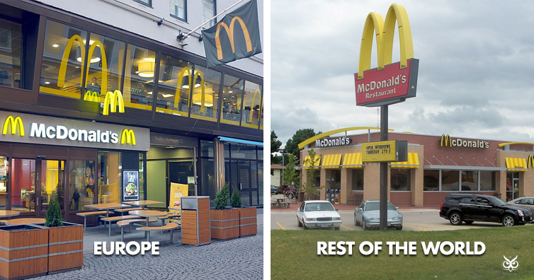
In recent years McDonalds has adapted to making its branding within Europe brown and green. These colours are naturally associated with health, life, and nature. The reason behind this change is to make the brand appear far more healthier than it really does. Outside of Europe the McDonald’s branding is still the original Red and Yellow golden arches, but within Europe the changes invoke a feeling of healthy food whilst the food itself is still the same garbage.

In the cadburys product placement they’ve used the colour purple for all of their products except for caramel which uses yellow. Purple is a colour associated with royalty, power, people with status and wealth. When you see this product the association with that is strong and makes you feel like you are picking up a product worth more than it really is. As for the logo design of Cadbury’s the gone for a golden design which the colour of gold is also associated with status and wealth. For example when you think of a bank such as Barclays or Nationwide the colours blue and silver will come to mind, because of this we have associated colour in our minds as something with status. Cadbury’s have clearly used the simplistic purple background with golden letters for the Cadbury’s logo to put out a symbolic message of “This is our product, and it has a higher status than everyone else”.
Children’s board games

Frustration is a classic children’s board-game and uses primarily primary colours such as blue’s. green’s yellow’s and red’s. The reason behind this is the simplicity asscoiated behind the colours, most children’s board games will often use primary colours as they attract the attention of younger people and sometimes even a secondary audience (Adults buying children boardgames).
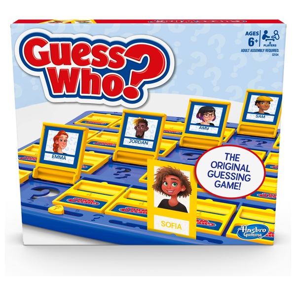
In the game of Guess Who, a game designed for ages 6 and up they use only the colours yellow, blue and red all primary colours of the colour spectrum as they are easy for younger audiences to see and notice. For example the colour wheel to a child would only be so few colours but to an adult there is a wide spectrum to to the colour pallet for example:

However, to an younger audience the colour wheel would look like this:

The reason behind this is the fact that younger audiences don’t yet understand that there are more than one type of colour for example there are a total of 260 shades of blue and on a wide spectrum the companies advertise of RGB keyboards that there are a total of “15.6 Million” different colours associated with it. Going back to the board game design it’s easy to understand why children only understand bright version of colours which are primary.
It’s a common theme throughout every board-game design associated with children, the same colour pallet is always used (with a few exceptions.)

The colour pallet is always, green, yellow, red and blue for younger audiences. The reason behind this is the simplicity behind it including but not limited to the brightness and “attractiveness” of the product. Colours such as yellow are asscoiated with freshness, happiness, & positivity, blue is associated with the sky, calmness, confidence & trust. Red is associated with energy, power & determination, the final colour green is supposed to resemble safety, energy & harmony. Understanding why these colours are the main colour pallet is very easy to realise once you know the meaning behind the colours as the game of Simon is who can remember the sequence the longest. It’s a brain training game and the simplistically of the colour layout helps out with that. Red being determination to complete the exercise without failure, yellow to resemble happiness and positivity, blue inspiring confidence and green resembling energy.
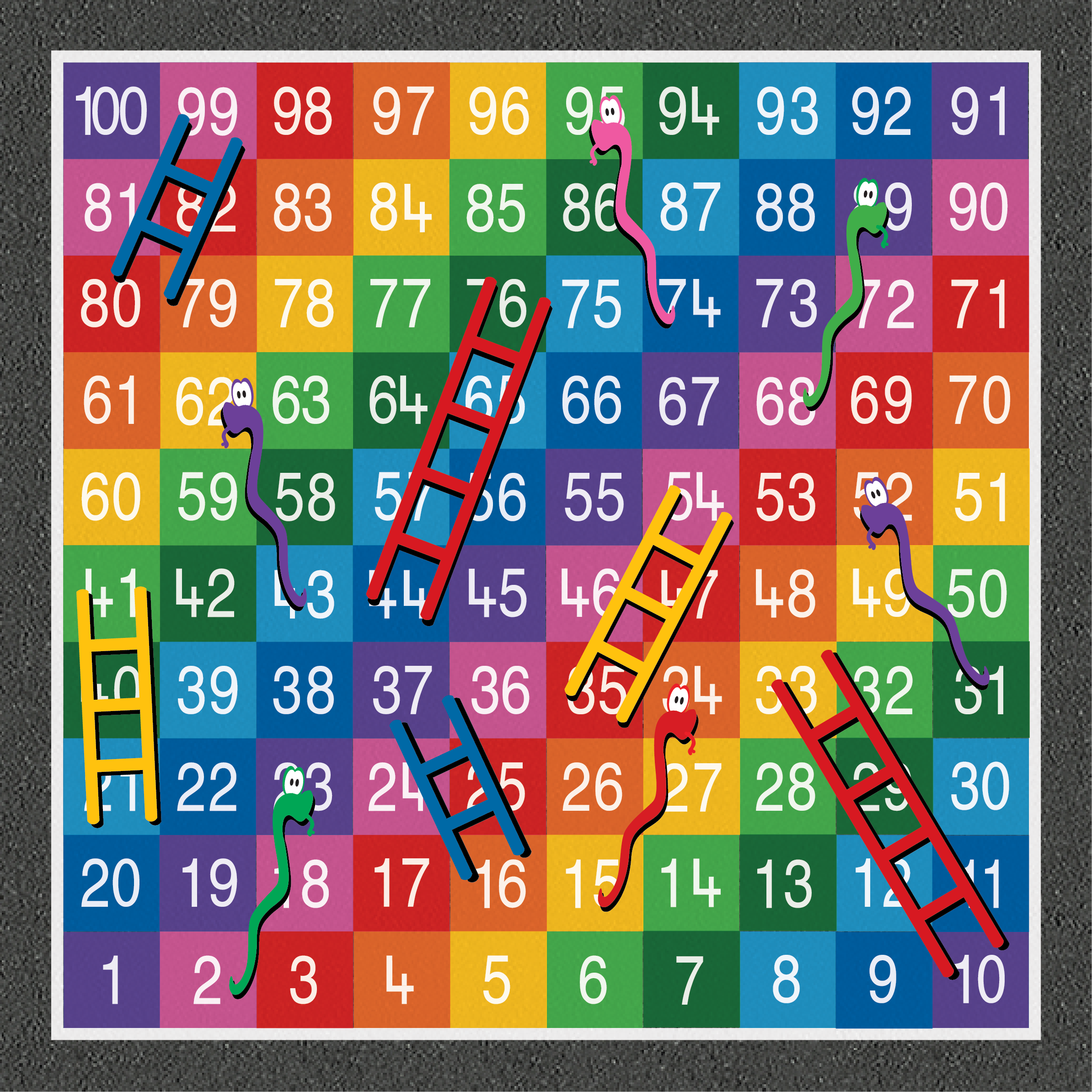
The famous board-game of snakes and ladders has seen many variants over the years but have always kept its simplistic gameplay design. I believe this is because it’s easier for younger audiences to play, you roll a dice you move your piece that many spaces if you land on a ladder you go up and if you land on a snake you go down. The colour pallet of snakes and ladders has mostly used primary colours. If anything a board-game such as snakes and ladders is a perfect example that simplicity is better over complexity.
Board-games oriented to an older audience
board-games are a difficult subject to find an audience for as they are technically for all ages but most board games are distinguished by their colour pallet. As previously mentioned most children’s board-games use a colour pallet of yellow, red, blue and green. It is to be expected that an older audience would have a dark pallet which would include different shades of colours and dark colours from the colour spectrum.

Cluedo is a classic murder who dun’ it scenario where you are thrown into the deep end and you need to uncover the murder in a game of chance and dare. The colour pallet of the orignal design used bright bold typography and a bold red background whilst the board-game itself is quite bland with dull greens and washed out yellows.
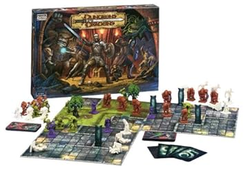
Dungeons and Dragons, an RPG game-board design made for all ages but primarily older audiences play the game in far more depth. Dungeons & Dragons is a fantasy tabletop role-playing game originally designed by Gary and Dave. The game was first published in 1974 by Tactical Studies Rules and has since been published by wizards of the coast since 1997. Using a d20 system as it’s gameplay mechanic similar to that of Magic the Gathering the gameplay, the gameplay itself easy to understand but hard to pick-up. The colour pallet is majorly different to any of the previous game-boards mentioned, using plenty of blacks, browns and darker colours in representing that this game is for older audiences rather than a younger audience The pieces themselves adopting purples, whites greens and browns. The game of Dungeons and dragons is a classic game adored but masses and the colour pallet has more depth than that of frustration in comparison not to mention difficulty. I believe we use darker colour pallets to make ourselves seem more sophisticated than we really are, separating ourselves further and further away from our child versions of ourselves with passing years especially with colours and how they evolve pretty quickly. (One minute you think there only four colours then you discovers there’s over 15.6 million versions of all the colours out there.) Because of this I believe the complexity of the design is what attracts older audiences, as we have “evolved” as people and have become far more complex and in-depth as human beings and are looking to reflect on that by playing something with less bright colours and much dark colours.
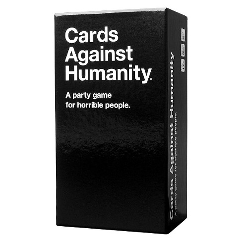
Cards against humanity is an adults card-game which is a party game in which players complete fill-in-the-blank statements using words or phrases typically deemed as offensive politically incorrect printed on playing cards. The game was originally launched in 1999 and has since then been recreated in 2011 using kickstarter. To play the game each player would drawn ten white cards which could represent purity as white is the colour associated with purity and innocence whilst the black cards represent intimidation and sophistication.
Whilst not a board-game it is a game played by older audiences, the box is a simplistic white and black and inside the contents can be pretty crude depending on the type of person you are. The reason behind cards against humanities colour pallet (black and white) is representative of a blank slate which the cards inside definitely are a blank slate for others to fill in the gaps with their own imagination. The fidelity that a person will recreate or ascertain things that the didn’t previously know about people will be discovered with a crude game such as this. The colour use of black and white are opposite each-other on the colour spectrum however, the meaning of black is symbolic of intimidation, sophistication & confidences. If anything the game of Cards against humanity can become sophisticated depending on who’s playing what time and when. The white symbolising purity and new beginnings. knowing this I can use these ideals against the brand identity but in a way, the use of black white is a very simplistic and clever colour pallet choice.
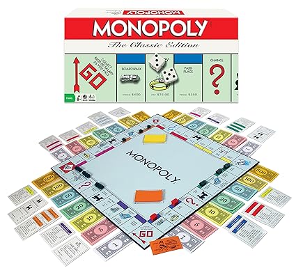
Monopoly is game oriented at mostly all ages but never struggles with it’s colour pallet by always retaining a greenish or bluish tint in all of their game-board designs. Monopoly is a game which normally uses metal or plastic tokens which can be moved around the board using a dice and the gameplay is about housing, finance and money management. The colour pallet has normally stuck to a red background (representing determination & power) with bold white letters above, (symbolising purity). However, the game-board itself is comprised of a wide variety of colours from purples, yellows, greys, dark blues and reds all atop of a washed out blue or green tinted background. Money is represented by colour, starting with a 1 dollar which is represented by grey and as you move up the colours change. At 5 dollars the colour is pink (cute), at 10 dollars it’s yellow (positive), at 20 dollars the colour is green (energy), at 100- 500 dollars the colour pallet has shifted to yellow and orange respectively which represent excitement & success.
Blockbuster
When I was in WHSmith I came across this game, and it caught my eye as it’s a game about Blockbuster. The thing is if you haven’t been living under a rock for the last 6 years, blockbuster hasn’t existed in the UK since 2013.
Blockbuster is a game packaged in a VHS tape box and pays homage to the late 80s early 90s using this method. Blockbuster was well known between this time period but later died off in the early 2010s as it was no longer financially viable thanks to services such as Netflix. Even though this game is directed towards children 12 & up the audience factor would be much older than this which is why I am using this as an adults party game. The game boards colour pallet is brown yellow and blue this combination of colours makes the game-board compelling using a tri-colour colour pallet. Knowing that I am not limited only to dark colours for an older audience I will be able to have extra flexibility with my design. Typography is prominent in the game of Blockbuster, adopting text over the games design. Typography will play a huge factor in the games design as typography is a main factor in graphic design. A reliance on too much colour would make the game seem more adaptable for a younger audience.
Audience Theories
An audience theory is an element of study that has been developed through theory and practice. It is the understanding of cultural understanding, appropriation and political correctness to not offend and adapt media so it is popular to a pacific audience.
Audience theories also include genre of media, sci-fi, fantasy, drama e.t.c.
Primary Audience & Secondary Audience.
A target market or primary audience is the audience that your product is made for, a primary audience is the audience that is generally targeted towards.. For example if a TV show was aimed at kids but the writing is far more advanced than that of a normal kids show. This TV show can have both a primary and secondary audience.
A secondary audience is an audience who finds a product or TV show and finds another purpose or love for said show. As mentioned before, if the writing is genuinely interesting and captures the attention of adults & children alike but they both see it in different views, that is a successful tv show. The kids (primary audience) watch it for the slapstick, fun and adventure and those who watch it for its writing prowess, drama and suspense. In my case, the primary audience for my game-board is marketed towards those 16 & over. This opens up quite a few doors, whilst closing doors for those of a younger audience, especially where game-mechanics or TV shows might not be suitable for those younger than the target demographic. For example according to the PEGI a website and organisation designed around the sole purpose of categorising game ages for players 16+ You can include mild sexual activity, a depiction of violence near enough realistic to real life and the use of bad language has become common once you surpass the 12 age rating.
Hypodermic Needle.
The Hypodermic Needle Theory is a communication theory which suggests the in the media messages are injected directly into the brains of a passive audience. It suggests that we’re all the same and we all respond to media messages the same way. This however, is only a theory but it cannot be looked over since many media related movies have been rumoured to have “hidden messages”.
sources of information:
https://www.bbc.co.uk/bitesize/guides/zy24p39/revision/1
How to Find and Target Your Social Media Audience (Free Template)
https://www.askaboutgames.com/pegi-rating/
Quantitive Research
Quantitative research is research carried out to measure numbers and usually obtained through questionnaires. A questionnaire is self-explanatory, they normally contain questions on whether you prefer to watch Space-Dandy or Yu-Gi-Oh!
Qualitative Research
Qualitative research is a method of research carried out by an individual which gives more information and is more concerned about the quality of the responses rather than the quantity. This type of research is conducted through focus groups and interviews with the public.
HASBRO
Summary
Hasbro is an American international company that specialises in the production and distribution of board-games and toys. Hasbro has the third largest economic worth coming in at $5.12 billion.
Hassen Brothers
In 1923, Henry, Hillel, and Herman Hassenfeld founded Hassenfeld Brothers in Providence, Rhode Island, the company sold textile remnants. For the following two decades the company expanded to produce pencil cases and school supplies, in 1926, Hillel left the company for another textile business whilst Henry took charge of the corporation. During this time, they began creating their own pencil when their pencil supplier began making pencil cases as well.
The change to toys & the Hasbro household name
Hassenfeld Brothers didn’t start creating toys until 1942 where they primarily became a toy company, their first toy ever was made from clay and was the doctor and nurse kits as their first ever toys. Sadly in 1943 Hillel passed away making Henry Hassenfeld CEO, this is when the company entered the plastic fields during World War II to support its toy line. It would be a whole decade until their first hit would come to be, this being Mr Potato Head which the company purchased from George Lerner in 1952. Then in 1954, the company became a Disney Major License.
In 1960, Henry passed away and Merrill took over the parent company, this is the era Hassenfeld Brothers expanded to Canada with Hassenfeld Brothers Canada LTD.
Hassenfeld Brothers became Hasbro Industries since they had sold toys under the Hasbro trade name, and shortened its name to Hasbro Industries in 1968.
1982 Hasbro™ created the successful toy franchise My Little Pony in the following year Hasbro™ purchased GLENCO™ Infant Items.
Throughout the next 3 decades Hasbro, Inc became the fastest selling toy manufacturer in world quickly purchasing other companies and setting up new distributions such as Hasbro Interactive (later sold to info-games for $100 million). Hasbro also attempted to create a competitor to Lego with their building block toy (built to rule) in 2003 but failed in dominating the market thanks to the targeted age group which lead the cease of production in 2005.
– Side note, “knowing that they failed on delivering a product thanks to the targeted age demographic I can learn from this mistake not replicate it.”
Subsidiaries
As of 2019 Hasbro has subsidiaries in over 30 companies including, DreamWorks, Tonka, Wizards of the Coast, Hasbro entertainment, Hasbro Gaming and Last Gang Records.
Evolution of the logo throughout Hasbro’s history.
History of the Hasbro Logo

Research
Inspired by board-games of days past I wanted to set out to design a board-game with trading card and die elements. The following games Yu-Gi-Oh! Pokémon TCG, Frustration, IKEA board-game & Dungeons and Dragons to name a few were all part of the foundation of creating an idea of what I wanted to do. I wanted to know what was already created so I didn’t tread on any area of copyright or outright re-creating other products without the knowledge that I am I doing that. Having said that I investigated the following:
Dungeons and Dragons is focused more towards late teenagers and adults but found its way into the hearts of younger audiences, that being the secondary audience. Its primary is targeted at 16+ Typically because of the areas that the game can be based off.
The art-style of dungeons and dragons is what attracted me the most, the dark hues of the colours used especially the gradient yellow on the title of book are what draw me in. The art direction has a feeling of maturity by which I mean the darker hues and background don’t necessarily stand out on the shelf but to those who are intrigued by the book and pick it up are greet with this simplistic style.
The visual history book Art & Arcana was an interesting read, it is talking about the illustration and art-styles used for the game and the direction the art took over the many years that it has existed.

I picked up this book with this thought in mind, even though you “shouldn’t judge a book by its cover” we all do anyway. Typically, if we don’t find something interesting, in this case this was the art direction, typeface, and graphic design which pulled me in, especially the illustration of the front of the cover being a dragon. I can incorporate these thoughts when choosing colour pallet and typeface when go to design my board-game cover. The serif style font used on the cover is what draws me in as-well, unlike most fonts used for a younger audience I have noticed that typically an audience that is older than 16+ is greeted with far more stylised and personal fonts when compared to that of a child which is greeted with the dreaded Comic Sans.

Whilst aimed at children this hit Japan exported card game has captured the hearts of many across different generations for the past 2 decades. The game has certainly evolved to become more advanced with each passing generation, making the game far more daunting to younger and newer player and even players who’ve played it for most of the games life-time
I choose to use Yu-Gi-Oh! as an example as it is the game, I am most familiar with and is one that I can understand well when talking about it. It was also the inspiration for why I am using traps in my board game. Traps are what they say they are, you set them up and you entrap your opponents’ monster or player into a situation. Meanwhile on another note I wanted to use Yu-Gi-Oh! As a prime example of primary and secondary audiences. Meanwhile the game is aimed at children 9+ This was when the game first started out, and since the people who originally played that game are now all grown up and probably have children of their own, this gives the game a prime opportunity to bank off both generations, young and old. Now even though the game’s primary audience is for younger audiences it still has inspired me how much they can do with that kind of game and because of the age difference and the willingness of wanting to make the game harder it’s definitely evolved to be for a more mature audience but the art-work is definitely aimed at children with its use a of a brighter colour pallet.
For example, when the game first started out, all there was, was Monsters, spells and traps. That was all that existed and that’s all you needed to know. Now you have cards such as Fusion, Synchro, XYZ’s Pendulum, Link, confused yet? This is the problem the game faces, below is a visual representation of what I mean:

However, the initial font used on the card throughout the last 20 years hasn’t changed, it’s a serif font but appears in a children’s card game. This might be another reason why the chances of the game having a secondary audience are so high. The game doesn’t adopt other practices where comic sans is used for everything children related. I personally like a serif and is a common trend that I am finding throughout my investigation for my project. However, the art-style and illustration are what I love from Kazuki Takashi’s work and is one of the reasons I fell in love with the manga (Japanese) that he had created

Ikea labyrinth was previously shown to me in the passed and is one of the main inspirations for my colleges project thus far. It is the idea of the gameplay that influenced my project the most. The idea of an ever-changing labyrinth where players add and take away exits was a brilliant idea for a foundational inspiration my own project and was the leading driver in it. Not only is the idea behind the game so simplistic, the game is clever by allowing players make the gameplay for them selves and allowing change on the board.
The bold Sans serif style is very simplistic and reminiscent of the IKEA logo for the game Labyrinth. A sans-serif font might me what I’m needing for my board-games logo however, in these early stages it’s expected to be based off a serif styled font. Either way I love the idea of a game that uses the game-board to expand the limitless possibilities of human imagination and is the main inspiration for my boardgames design. Beyond that the illustration on the cover seems a bit too simplistic but this might just be because of the IKEA logo being only yellow one a blue background. The die element of the board-game was conceived when researching back into games of the past, Frustration. The idea of a die creating RNG in the game created endless possibilities for players to discover and create.
Choosing a colour pallet
Whilst a colour wheel for a younger audience would look something like this the actual colour pallet thanks to my audience factor looks a bit more like this. Thanks to this it has opened a lot of opposites for my colour pallet and has made it a lot easier to design and choose a colour swatch that works best thanks to the different hues

Inspiration for my game-board, during the early stages of my design I wanted to grab a foundational idea for what I wanted to create. I know I wanted to make a board-game- TCG hybrid aimed towards

Colour Pallet Chosen
The colour scheme that I wanted to follow for my design was chosen when I was messing about with colour swatches and looking back at the inspiration illustration of board-games of recent memory and I wanted to follow a dark but still simplistic colour pallet of dark hues and colour compliments. I want to follow the darker background of dungeons and dragons book cover with the dark greys and blacks with brighter colours to make the stylistic font stand out. This is where the following shades of the colours come into play. They all caught my eye and seem to complement each-other well. However, without further experimentation I won’t know but this is the colour swatches I have chosen to start this project out on.

Pinterest was also useful for picking out colour pallets that I wanted to use in my project. Especially the use of dark blue, blues, yellows and oranges. From the beginning I knew I wanted to incorporate blue and yellows as they are the colours that I feel more of an emotional connection to. Not to mention yellows and blues match together beautifully just as orange and, grey, yellow or a mix of all.

The programs I will be using to conceptualise my project will be Krita and Photoshop. I will be using these programs as I am far more familiar with them than I am with Illustrator.
 I want to use Krita because it’s an easy enough program to understand, It has many of the functions that Photoshop has with some limitations. However, the open-source program is free for users to download, this eliminates any worries about paying for a license for Adobe when out of college. The tools inside of the program are very similar to that of Photoshop, Crop, blending, paint tools for example.
FONTS
Knowing that my audience was oriented towards an older demographic. Typography that I had in mind is like that of handwritten or cursive hand writing. I used DaFont to research into other fonts that I could use or give me an idea what I could incorporate into my final design.
 White Smith, I found this font on DaFont, it caught my eye as it is a style of typography which really suits my age demographic. The font gives off a handwritten vibe, which is what I wanted for my title font of my game-board. Other font styles I investigated included Sans Serif, the bold style font is something that would pack a message for my game-board, and I wanted to try and give my title font a unique feel.

Monster Twenty is a sans serif font that I found on DaFont, the feel of this font gives off an eerie vibe as if it’s straight out of the beginning of a horror movie. This font can come in handy depending on the direction of my game-board. If I want a horror oriented game-board I can use this font if I want a far more stylish game-board I would use White Smith for the title font. I like this font because of the boldness is possesses not to mention the flexibility for edits regarding the font compare to that of White Smith. You can easily enlarge and thin down letter in Monster Twenty without making it feel out of place. However, the font whilst being flexible might give my board-game the wrong vibe but is still a bold font none-the-less.
 This font seems to be a dream send as it is already developed to be created into a title. This style of font caught my eye on DaFont because of its simplicity. Just like Monster Twenty it leaves open room for edits, expansion and change. (Enlarging, bold, underline and stretching letters.) This font is one I will consider for a title font

Whilst not leaving much room for change Modern Sans Light is a font that caught my eye for use on cards regarding board-game play. It’s a simplistic easy to read font whilst maintaining an older audience aesthetic. (for example, Comic Sans is a font used mostly for younger audiences to read text as it’s a bold in your face font. However, that font doesn’t appeal well to older audiences who have grown beyond fonts like comic sans and adopt fonts with far more character.)
 Knowing that I wanted to use a serif-based font I quickly went onto DaFont.com to investigate fonts I could use for my project. I used the Serif feature to quickly get to the type of font I wanted and went from there. This is when I came across Cinzel a simplistic font that boasts a bit of character. It reminds me mostly of a font you’d find on the front cover of an Agatha Christie’s book cover for something like Poirot. Quickly this gave a feeling of depth and character, whilst the actual Poirot font is a Sans-Serif font this serif font still reminds me of that sort of era and is something I want to incorporate into my design. Most probably my logo. In the mean-time I like this font the most as out of all the previously mentioned fonts this one stands out the most to me and boasts the most character.
SKETCHING
On-route back from a trip from Birmingham I had some spare time to myself and I used this time to whip out a piece of paper and start sketching knowing my deadline was near for my project. With this time, I came up with the following from the inspirations used for a foundation for the project.
 I came up with the idea of the creature die when thinking back to Dungeons and Dragons and Yu-Gi-Oh! They both have similar concepts but different gameplay, and the whole idea around my project was around having an opponent, monsters and random chance. With the inclusion of the creature die, it created opportunities for me to have fun with the early stages of the game.
 When I was quickly sketching down ideas on this train journey back, I managed to get a bunch of ideas down on paper before they flew out of my mind, thankfully I managed to not loose this piece of paper and kept it on me knowing I could use these as my rough sketches.
The idea for the name came when I was thinking of what the game was about. The game is about monsters, opponents, an ever-growing maze and traps. I thought about titling the game monster labyrinth, but I thought this was too on the nose and then the word entanglement came to my mind. It’s mean is to be entangled by something or someone. Not necessarily the same to a labyrinth but it sounded good on paper. However, since it wasn’t what it represented, I had to research into other synonyms and name combination that’ll work with my design by this point I had already started to create a box cover for my project.
 I stuck with the word Labyrinth and combined that with abnormal a word to describe events which are not considered natural. In this case the players choose and decide how the game plays out with pieces and build out their maze across to the other player whilst also setting up creatures to defend and attack your enemy with. Abnormal Labyrinth is the name I stuck with from here on out.


Evolution of the Abnormal Labyrinth Logo

Following a flow chart structure above I have created the evolution of the Abnormal Labyrinth logo and how I came up with the final design from conception to the finished product which is found below this paragraph. When creating this logo, I wanted it to be simplistic and reflect the game without giving the entirety of the game away. Using just the die in the end allows for a simplistic logo rather than having too much going on in the image which is what was happening with the logo involving the card. So, having the text beside the die rather than slanted beneath it felt a bit more natural rather than giving an unprofessional feel to it.

I drew up the cube digitally in Paint.net before transferring it over Krita, where I could apply text transformation and image manipulation in an easier fashion like that of Photoshop

The swap over from Paint.net to Krita was as simple as drag and drop, within this program I designed the logo easily and managed to finish


DIGITAL MOCK-UP
 This is my final design after managing to create a box shaped design. As for the actual box cover, this can be found below.


After being given the ability to use Photoshop CC I was able to finalise my logo for my game-board. Having the digital sketches done already meant I was able to design the die with little time and effort. I was able to create the logo and icons on the die and manipulated to look as if it was the official die from my sketch designs.

After some feedback I learnt that the logo is hard on the eyes and should invert the colour to white, this was in-fact the case, the swap to white definitely made it easier on the eyes.
Pre-final

After viewing it and comparing to other boardgames I felt something was missing, knowing this I added a slogan at the bottom of the board to fill the massive empty gap underneath the logo.
Adding a slogan


Poster Advertisement

